Tuesday, 31 December 2013

The Saga of the Paint-effect Elves - Part II

In my first post on this subject, I smugly joked that now that I had found a paint that gave a convincing chrome effect, I should make sure I bought enough tins. Well, with predictable tempting of fate, I finally got round to buying some tins (18 months after writing that post) and discover that Dragon Colour chrome paint is no longer in production.

[Sigh]

So it's back to square one. Not quite square one actually, because in the meantime I've been building up a collection of high elf models from ebay and have amassed quite a collection, all waiting for their shiny new chrome job.

So what now? Well, I do another google search and discover another technology that I missed last time. There is now a chroming process that is applied like a paint, but is a chemical process (akin to the silver mirroring solutions used to create mirrors). The results are really impressive...


Furthermore, you can use the process on anything. You can buy the chemicals and do it at home, but you'd need a spraying setup like a car body shop, which I don't have.

You can purchase a non-spraying, bath type of rig where you pour the chemical over the object, but in either case the chemicals are really, really expensive.

And how they deal with detail is unclear - I haven't seen anything as detailed as a miniature silvered in this way.

So if I'm going to look into this further I'm going to have to ask a professional and get a quote from him. That involves approaching someone who sprays cars all day for a living. Like, a real man. I can't describe the sheer terror I feel for approaching a burly, tattooed gear-head and introducing him to my pathetic little hobby of collecting little stupid toy soldiers. Imagine his confused and disgusted face when I tell him what I do. Picture his contemptuous incomprehension when I show him a sprue with silly little toy soldiers on it. And not even actual military soldiers (he'd probably like that), but babyish Harry Potter rubbish. Imagine his bearly-contained anger when I correct him: "actually, they're elves, not goblins".

Email would normally be the perfect medium for this sort of enquiry - anonymous, distant, easily escapable. But real men who wear spray masks all day for a living don't really do emails, do they?

And I know what they'll say... £100 per sprue (or whatever). There's no way this is going to work out cheap. And therefore, there is no way this will work out.

[Sigh]


Saturday, 14 December 2013

A sketchbook begins

You can count the number of posts I made in 2013 on two fingers (three if you include this one). How rubbish is that?

So while I haven't been posting much, I have been doing a lot of sketching an doodling and thinking about what I wish I was doing in my hobby. That's as close as I can get to actually doing my hobby at the moment.

So as a kind of early new year's resolution (and we all know how those turn out) I'm going to try and post up a few of those doodles and sketches. They might not make much sense at this stage, but I just want to get them published in some form or another as a kind of online sketchbook. I can always come back to them at a later date and explain what the scribbles mean.

So in hoping to start as I mean to go on, here's a sketch I made. I'm not going to explain it much - that'll come later - but in the interests of building up a sketchbook, here's a sketch...

Bonegrinder giant - concept
That is all.

Dark Elves are dead! Long live Dark Elves!

These last few months saw the release of a new Dark Elf book and new range of models.

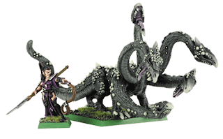
Let's go back in time to 2001. Who's that ugly, sweaty loser collecting dark elf models? Oh, it's me (nothing's changed). I've just bought a hydra. This ugly piece of dog mess...


In fact, I've bought two because everything counts in large amounts, right? I'll add it to my growing collection of dark elf models:

  • some ugly spearmen with huge hands like bunches of bananas
  • some 2-dimensionally posed witch elves with ugly hair, crudely-modelled fishnets and ankle boots
  • the most laughable statue in the warhammer world (that thing is supposed to move around the battlefield, and is supposed to cause terror - how it achieves either of those things is beyond me). If I was Khaine and someone made a statue of me that looked like that, I'd smite his ass.
    You cause terror, you say? We'll just have to take your word on that.
  • Lots and lots of crossbowmen (which are the same as the spearmen). I know I've mentioned the spearmen, but... the skirts. Have you seen their skirts? Could they be any more uncool? God those models are awful.


I knew they were ugly when I bought them. So why did I buy them?

Well, because the idea of dark elves is cool. We've all seen Legolas - he's the coolest, right? Well, imagine an evil Legolas. Riding a Manticore. And then think of every sexy, bikini-clad, impossibly-huge-breasted fantasy woman on every heavy metal album cover ever.

So let's give a coolness score to the concept of any given Warhammer race, and then give a coolness score to the accompanying range of models, and lets call the difference between those two scores Delta_Cool. Well, for years now, I'd say the warhammer army with the highest Delta_Cool (and thereby being a massive let down for everyone) would be the Dark Elves. Just about every model in the range was really badly designed. I mean, case in point: close your eyes and conjure the terrifying notion of a manticore charging towards you. Now open them again and look at this...

Rrruff... Put 'em uuuup... Put 'em uuuup....


A friend of mine who used to work at a GW store said that all the staff referred to it as the "Doom Baboon". Enough said.

To be fair, we later had Cold One Knights and Corsairs, which are some of the best models in the game. But the good models were woefully thin on the ground.

Okay, okay, so the old models are poor, but now we have new models... hooray!

Or is it hooray? Well, it's a hooray with a little tear in one eye. Certainly the new range look a billion times better than the old models. And thank Khaine for that, but there are a few things I'm having real trouble getting used to. Most notably:


  • The dark steeds and their funny teeth
  • the unfeasibly impractical monowheel chariots
  • the slightly awkward cauldron on rickety, vagina-shaped staircase
  • the swordsmen having swords thicker than their arms (compared to the beautiful weapons of the corsair models)
  • the slight move back to an older aesthetic for the dark elf helmets. I'm not a big fan of the big sticky-out things on their foreheads
  • and of course (sigh) the hydra, which I think GW are doomed never to get right.

The new hydra from Games Workshop

But listen to ungrateful me. This model range now holds its own against others in the Warhammer world, and also against other rip-off model ranges that had previously been filling the vacuum. And crucially we now have plastic Witch Elves, and they look amazing.

Sadly for me, the collection of dark elf models I have (many of which are some of the only models I have painted in the last 13 years) are now redundant. I should keep them, but what can I say... I'm a stupid games workshop whore. Pass my wallet, would you?


Friday, 11 January 2013

40K for 40

I occasionally have really silly ideas.

Silly, persistent ideas that won't go away. Silly, compulsive ideas. Silly destructive ideas that lead me down an irresistible rabbit hole into a world of hurt.

Here's the silly idea I had this week...

I turn 40 this year. And for some reason, having a zero at the end of your age makes you reflect on what you've done so far and what you're going to do in the future. You can tell from my previous posts that my hobby brings a kind of bitter-sweet sense of loving/loathing. I wonder if there is a way I can reignite my hobby as I turn 40? Is there a way I can reboot; adopt a different attitude; ring in some changes?

Ohhhh, wait a minute.... I'll be 40.
As in 40 thousand.
As in Warhammer 40,000.
Get it?!

That's the idea, right there. At this point I should flush my brain out and pretend the idea never popped into my head. But it's too late. It's there now, like a hungry grub.

Do I really want to spend thousands of pounds collecting miniatures when a) none of my friends want to play 40K, and b) there isn't a chance in hell that I will ever paint them. I have a collection of unpainted fantasy models that I bought thirteen years ago. In fact, I'd estimate that about 2% of my model collection is actually painted. Heck, I'd estimate about 30% is still shrink wrapped. What the HELL would I want to start collecting 40K for?

Didn't stop me from putting the new Dark Angel Knights into photoshop and seeing how they'd look as Black Templar assault terminators though...

Black Templars concept

I... hate... you... games... workshop.

Tuesday, 18 December 2012

Squig colour scheme

Squigs are one of those curious things in Warhammer where the idea behind them is poorly served by the miniatures. Don't get me wrong, I love the current range of regular squigs but there's plenty to hate too.

First of all, let's take the idea...

  • Goblins on space hoppers.
  • The alien from Dark Star.
  • Some sort of fungus puff ball with teeth.

Mix them together and you have squigs. They're funny and silly and a unique part of GW's range of orcs and goblins (y'know, like goblin fanatics). What's not to love? Well, the miniatures.

I've always hated the old 80's squigs because they looked like giant goblin faces rather than a separate species of beastie (but then I always hated Kev Adams's style of orcs and goblins anyway). The "new" ones released in 2000 (by Brain Nelson maybe?) updated the look and made them look far more vicious, but they also included funny long-tailed ones that didn't quite fit with the space hopper idea. I didn't mind that at the time, but it was a design choice that would return. By the way, I'm ignoring squig designs on the peripheries of warhammer, like the Rogue Trader squig swarm and the mohicanned squig hound from Warhammer Quest, but they too show how the design has always been inconsistent.

Then you started seeing other squigs crop up in various places: hairy squigs on Wurzag's staff; long-legged 40K attack squigs; orc-faced bomb squigs. And then came the giant squigs: a podgey-looking Gobbla and the train-wreck that is the current great cave squig model. Each one played around with the standard design, but never really captured the bouncing-ball-of-bitey-teeth idea again. One exception: the little pet squig owned by the goblin boss in the Battle for Skull Pass boxed set (though even he looked a bit like a pumpkin).

WAR came along and expanded the squig design to include extra features (exhaust tubes and rhino horns), something that hasn't filtered through to the miniatures, but a new body shape was now firmly rooted: the teardrop-with-long-legs. It had been brewing for a while but now it had become the official shape of a squig, and was appearing in artwork. The space hopper idea was dead.

And then came "The Chase". Dear god. What an ugly mess. The squigs now looked like big walking faces; faces that were designed really, really badly. The gnashing ball of teeth idea had gone and squigs were now just stupid looking faces again, this time on long slender legs.

Finally, the latest, and THE WORST squigs of all: the mangler squigs. I'm assuming they were designed by Trish Morrison. They have that familiar "utter dog sh*t" look about them that we gamers have loathed over the years.

Orcs and Goblins has always suffered from "training ground" syndrome. Got a new sculptor? Wanna see what he can do? Let him loose on a goblin or squig - they're all kinda goofy and different so what harm can he do?

But over time that's meant that there's no coherent look to the army. It's a mistake to say that inconsistency and incoherence is an "orcy" trait, and should therefore be shown in the figure design process. The unique, incoherent, inconsistent, crazy, goofy look of an orc and goblin army, the orc and goblin "brand" if you will, can be designed into the models, but the design and development process should be as rigorously followed and consistently applied as for models of any other GW race.

So with all that said, I got to thinking how I could include squigs in my orc army in a way that wouldn't suck. What came out of my thinking/playing was a kind of rule book for squig design:

  • Go back to the bouncing balls where possible
  • Go back to the puff ball idea - ie a kind of impossible fleshy/toothy beast without a well defined skeletal system and no sensible system of internal organs.
  • Give the models more lift and exaggerate the sense of bouncing, rather than running
  • Exaggerate the teeth - a squig herd should look like a mass of gnashing teeth.
  • Pick up on the idea of them being fungus-based in their colouration. Traditionally that has meant weird and wonderful colours, but make the colours more naturalistic. I like the idea that you could model and paint a few puffballs in a fungus forest in the same colours as the squigs. Hell, you could even model some teeth or eyes developing in the puffballs as if they will eventually reach maturity, grow legs and bounce off!
  • Stay true in some ways to the original squigs (in this case by converting original models where possible and using a red, well russet, colouration).

And here's what I came up with in photoshop. with some points to note:

Squig herd colour scheme
Squig herd
The regular squigs in the herd have extra teeth and many are lifting off the ground.

The colouring is red, but also incorporates green to make that link to the physiology of the orcs.

The teeth are green. I'm not sure how this would look on a painted model, but I like the idea that the teeth aren't made of boney enamel but some sort of hardened fungal equivalent.

Skarsnik and gobbla colour scheme test
Skarsnik and Gobbla
Gobbla has a mouth full of huge, very scary teeth. Much more fitting for his status and less like a sock puppet.

Not limited by a facial bone structure the teeth kind of grow out of the fleshy body of the squig like spines or lamprey teeth.

Great cave squig colour scheme test
Great cave squig
The great cave squig would have to be modelled entirely from scratch. I was playing with the idea of it being in the downwards part of the "boing", like a squashy ball as it hits the ground, and how that would distort its shape. I think it's fun and looks cool but I think the uninitiated would struggle to see what was going on - they might assume it was crawling on the ground. I think this would only work if the army also included other great cave squigs modelled in the upwards part of the boing, so you get a sense of how they travel.

Mangler squigs colour scheme test
Mangler squigs
The mangler squig is a rough and ready concept sketch - I was playing with the idea that instead of chaining two giant squigs together, you chain a larger number of squigs together of different sizes. I think there are too many here, but I could see it working, and giving more of a sense of random chaos than the current crappy model.

Tuesday, 4 September 2012

Total war(hammer)

total warhammer logo

I've been thinking a lot recently about what my ideal collection of models would look like (if money time etc were no object). A complete army perhaps? Played on a table with nice scenery? Hmm, yes. That goes without saying. But of course, my mind wanders and I start wanting more. Much more. Until  the only thing that will satisfy me is TOTAL WAR(hammer).


Total what?

It all starts with a bunch of friends. Like most people, I have two distinct groups of friends:
Group 1: old friends I've known for years
Group 2: whichever guys I happen to be friends with in my current job/location

In years previous, Group 2 has always been totally against my hobby, and I'm used to keeping it under wraps. It's only by a stroke of luck that currently Group 2 are all into wargaming. If ever I move to a different city or job, I can well imagine going back to never mentioning it to the group for fear of utter ridicule and rejection.

Group 1 on the other hand have only ever really dabbled in gaming (though never collecting miniatures) and have politely humoured me over the years by indulging my hobby when we meet. They're not really into it, and so I never push hard, or expect any sacrifice or expenditure on their part. The way I see it is that if I want them to play a game with me, I should provide all the models (and nibbles) and make the whole experience as enjoyable for them as possible. Call it a wargaming reacharound.

Perversely, I prefer playing with the inexperienced Group 1 friends than the seasoned gamers of Group 2. Seasoned gamers are quite used to bashing and clattering their models around and using scratty bits of makeshift scenery. They don't understand why I spend so long carefully taking each model from its case or why I insist on using a GW measuring stick instead of a B&Q tape measure. They don't understand why I get so p*ssed off when they represent their Lord-level killing machine with a rank-and-file model (something you only discover when you charge it) or why their spearmen with a bit of blu-tac on his spear-tip turns out to be an army standard bearer.

Non-players are far more respectful of your models, and they instinctively dislike "count as" proxies. When you tell them "that guy is your wizard" they get a little look of excitement on their faces and carefully examine the model, hoping to see some particularly characterful model in a pointy hat. They don't want to hear "just pretend that spearman is your wizard" or "we won't bother with a river because I haven't got one". If they're going to invest their time in a game, they want to know there's plenty of awesomeness on the table, and I'm going to have to provide it all for them.

So unlike a lot of gamers, I simply can't focus on collecting one army. Indeed, I insist on having more than one. What if, say, I invite a Group 1 friend over and suggest a game of warhammer? I would then have to produce an army for me to use and one for him to use. Since he doesn't know much about the Warhammer universe, I'd want to offer him an army that would appeal to him, and since he's unfamiliar with the game, I'd want the two armies to interact well with each other and contrast nicely in their styles of play and their presence on the table. And since it might be the only game of warhammer they will ever play, I'd want it to knock their socks off - look amazing, play well, have cool and interesting things going on. I would want to produce out of a hat the sort of demonstration gaming experience that most gaming clubs work hard to put on during a gaming convention.

So in a sense, total warhammer is the perfect demo game: it looks impressive, you get a real sense of the warhammer universe and you feel immersed in the experience. All gamers, old and new, should be seduced by it and want to play.

So rule number 1 of total warhammer is:
1. Everything should be awesome.


One paintjob to bind them

Let's face it, I'm only ever going to get the opportunity to play this magical demo game about five times in my life. But a nice side effect is that I won't have to compromise - everything involved in the game will be created by me.

I'll be honest, it's very rare that I play against an army that I think looks cool. Mostly, the models come out and I politely go through the ritual of saying "hey, nice paintjob, bro!". But invariably it's not really a nice paintjob; its a gloopy mess of thick drybrushing in ugly colours. And that's assuming they're painted at all. So no matter how good you think your army looks, the game as a whole looks rubbish.

Having to produce more than one army gives me a chance to model and paint opposing armies in the same style, with visual and narrative links to each other.

For instance, you could give every army in the collection the same type of base, and those bases could be painted to match the surface of the battlefield, so a rock on an empire soldier's base is painted the same way as the rocky scenery he's standing on, and the same as the rocks used in the orc rocklobber that's aiming at him. Extend that further and you could adorn the models with trophies from other armies - Grimgor holds up a severed head that is painted in exactly the same way as the empire knights he's fighting.

Further still and the buildings and scenery could be themed towards the two armies, with matching iconography and decoration, so a charnel pit is filled with bodies dressed in the same livery as the soldiers standing next to them; the mushrooms growing in a fungus forest look like the same fungus a goblin shaman is munching on and that are growing all over the orc-themed buildings.

Potentially you've got something that is visually unified and immersive; something that only Warhammer Online has managed to do so far.

So rule number two of total warhammer is:
2. Everything should be part of a shared, strong, visual aesthetic.


What's the story?

A really important aspect in achieving this immersive experience is a sense of narrative realism. We all know how weird and wacky it is to roll up randomly generated terrain and find that someone has decided to build their farmhouse next to an ancient temple of evil that gobs out fireballs at them whenever they walk past to milk the cows.

Similarly, I've never been a big fan of Lizardmen and Tomb Kings. Not because of the army background or models (both are great) but because in the Olde World they exist on a separate continent. Broadly speaking, warhammer is "set" in the Empire (though you could set it somewhere else). So having a bunch of skeletons rising from desert sands and egyptian-style pyramids seems totally out of place. Sure, you can give them a back-story that explains why they're on tour, but half the fun of a well-painted lizardman army is all the jungle vegitation adorning their bases - you're telling me they bring their jungle plants with them?

For me you have to believe that the corner of the warhammer world portrayed by your gaming table could actually exist, and that the armies marching around there are there for a reason.

Rule number three therefore is:
3. Nothing should exist outside a believable, coherent narrative.


Invisible fireballs

One of the greatest things about computer games set in the warhammer universe is being able to see magic effects. It's a huge area of the game, and yet on the tabletop is belongs purely in your imagination. Wouldn't it be great to have magic modelled into the game - real, tangible, colourful magic.

In fact there are all sorts of things we use in warhammer that we don't expect to have to model - explosions, casualties, troops occupying buildings. Not to mention the mechanical tools of the game - dice, movement trays, templates, wound markers etc, that with a little modelling and painting could keep your disbelief in suspension. How often have you placed a dice next to a model to represented wounds, only to pick it up by accident later on and roll it?

Now, GW have done much in the last few years to correct this. We have themed resin dice, engineer's templates and rulers, Battle for Skull Pass wound markers, but it's still an area of the game that remains largely untapped.

Rule number four is:
4. Everything counts, not just the models.


The spirit of the Workshop

Lastly, there's the issue of customisation. GW's intellectual property is what has made the game so successful - no other game can match it in the long-established, rich and detailed universe it has created.

So it would be dumb to throw all that away. I know a lot of people get a blast out of mashing up GW stuff for comic effect (samurai orcs, teddy bear tyranids etc) but it's not my bag. I see it as a responsibility to best represent the world and mythos that GW have established. And in a collection that includes many armies, each one should demonstrate its unique character as defined by GW. So an orc army should be uniquely orcy. And a high elf army should be uniquely high elfy.

However, there's a rich tradition in the modelling community of giving your models a twist - something original; something that identifies it as belonging to you. It's as if you take an imaginary seat at the table of GW designers, modellers and painters and make your own contribution to the genre.

Now, I happen to believe that GW actually get it wrong sometimes. There are plenty of examples of models that seem to fall short of their own high standards, or don't fit with the vision described in their accompanying descriptions, or seem incongruous with the rest of the army. I always want to fix that.

I want my collection to walk that line: to best demonstrate GW's ideas and continuity directly as GW intend it, while presenting something original and unique. And in doing so, I'll try and fix a few things too.

For that reason I'm going to stick to GW-only models in their most up-to-date incarnations as much as I can, but include modifications to some core designs. I'll break with GW convention, but only where I feel it still fits the spirit of what GW intended.

So as toadying as this sounds (especially given the amount of money we pay them), my last rule of total warhammer is:
5. Respect Games Workshop.


So there are my rules. Don't be surprised if in my project logs I refer to them occasionally (it saves explaining all that again).

If I stick to the rules of Total Warhammer, I might just end up with the collection of my dreams.

Then I'll be forced to kill myself, knowing that never again would I achieve such perfection.

Friday, 31 August 2012

High elves colour scheme

I've mentioned in a previous post my idea for paint-effect high elves, specifically making them highly reflective chrome effect. So let me show you how that might work.

A few ground rules

First of all, whatever colour scheme I choose mustn't just fit in with the overall GW universe, but also with my vision for "total warhammer"(ie an all-encompassing aesthetic applied to all armies, scenery and accessories in my collection, with a believable narrative linking them all).

I intend to collect a number of armies and so having light and shade, not just aesthetically, but also in character, will be important to giving each army its own distinct identity in the collection. However, GW are keen to make every race either "properly evil", or just "not-evil-all-the-time"; they don't really have any white-hat-wearing good guys.

High elves have traditionally been the closest you get to filling that good-guy slot, though in GW's universe, while they may fight a lot of bad guys, they aren't particularly nice conversationalists. So while they are white-hat-wearing good guys, they'd break your face if you got any mud on their nice, bright, white hats.

I want my high elf colour scheme to show that dichotomy. So my idea is to have an army whose armour and robes look not of this earth; angelic; nothing like the grubby horsehair shirts of the Empire.

This works for me because:
1. the whole glittering supermen thing suits the elite nature of their army composition and units.
2. there's a simple black vs white relationship with their evil counterparts, the dark elves. I like the idea of pushing that to an extreme: an all-white army vs an almost identical, but all-black army. Kind of like Spy vs Spy.
3. the high elves get paint-effect armour just like their dark elf counterparts. Again, the symmetry of that I find appealing.
4. I haven't seen it done before. To push the colour scheme to a total absence of colour would hopefully  be original and garner fame and kudos with my entirely imaginary audience.

So here are the rules:

1. Impossibly white clothes
2. Impossibly shiny mithryl armour
4. An overal light and bright tone, avoiding dark shading.
2. No other colours (other than perhaps magic-effects)
5. As much white as possible, or shades of white (for animals, wood etc).
6. At a push introduce grey (for shadow warriors, patterned fur etc)

All white now

Games workshop have a nice little pdf template you can use to test your high elf colour scheme.

I used it to see how this colour scheme would look, and here's what I came up with.


You'll notice there's an awful lot of grey, but that's because chrome paint will give a very high contrast of light and shade. But notice that I've stripped the rest of the detailing of colour - no shiny red jewels, no blue sashes and ribbons. Just white. Heck, he's even wearing white gloves so that as little flesh is showing as possible.

I like it. But the picture doesn't look like a real life figure. So I found a picture from ebay of some painted units and fired up photoshop. Here's what I came up with...


Now we're talking. Okay, I'll be very lucky if the chrome paint gives me that super bright silvery look, but overall those colour scheme rules are working. Note that the hair isn't pure white, but so blonde as to be a shade of white. Importantly, the sea-themed detailing hasn't lost any of it's character, despite being bleached of colour. The unit has a really strong visual identity. It's attention-grabbing and (hopefully) original.

Game on!